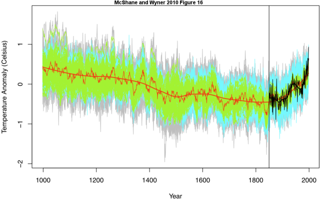
As I understand it, this graph is the revision of the famous hockey stick graph. Apparently the algorithm that produced the original hockey stick would create a hockey stick out of any data set. So now we have this graph.
I really don't know enough about statistics or the methodology to say whether this graph is accurate. Lets suppose for a second it is. The red line represents the scientist best guess at earth temperature for the last 1000 years. The gray area represents the margin of error for this measurement.
I think it's interesting how little this graph tells us. You could say the following about the graph, all of which are true:
- Data indicate that the earth's temperature has been rising since industrialization.
- Data indicate that the earth's temperature will continue to rise.
- Data are inconclusive as to temperature trends in the last 1,000 years.
- Data are consistent with no change in temperature for the last 1,000 years.
- Data are consistent with slight decline in temperature for the last 1,000 years.
3 comments:
So the gray area is the margin of error. What is the green? Is that all the data points collected from around the globe? Then the jagged red line is the median or mean temperature for each year and the smooth red line is the trend? Why all the black lines on the post industrialization part of the graph?
Too many questions to make any conclusions. But let's suppose that the green represents thousands of data points for a given year. That would make the red line quite accurate (assuming the data themselves were accurate). My guess is that the upward trend on this graph would still have statistical significance.
I'm becoming more interested in geoengineering. I don't understand the environmentalists who think we've messed up the planet and that we shouldn't use our ingenuity to solve the problems, we just need to stop interfering with nature.
Here's the statistician's blog this come from, indicating that the gray band is the margin of error:
http://wmbriggs.com/blog/?p=2773
I don't know what the black line is. I suspect that it's our actual temperature readings. I suspect the green represents data points from tree rings and maybe ice cores.
This is from the paper:
[I]t is possible that the proxies are in fact too weakly connected to global annual temperature to offer a substantially predictive (as well as reconstructive) model over the majority of the instrumental period.”
You can download the paper here:
http://climateaudit.org/2010/08/14/mcshane-and-wyner-2010/
Here's the abstract:
We find that the proxies do not predict temperature significantly better than random series generated independently of temperature. Furthermore, various model specifications that perform similarly at predicting temperature produce extremely different historical backcasts. Finally, the proxies seem unable to forecast the high levels of and sharp run-up in temperature in the 1990s either in-sample or from contiguous holdout blocks, thus casting doubt on their ability to predict such phenomena if in fact they occurred several hundred years ago.
"But let's suppose that the green represents thousands of data points for a given year. That would make the red line quite accurate (assuming the data themselves were accurate). My guess is that the upward trend on this graph would still have statistical significance."
I think herein lies the problem. I'm sure that the average of the green dots produces a pretty good average of tree-ring thickness. But that doesn't mean that tree rings are correlated strongly enough with temperature to let us know whether the earth is getting warmer.
Post a Comment